> ## Documentation Index
> Fetch the complete documentation index at: https://wb-21fd5541-feat-cli-docs-generator.mintlify.site/llms.txt
> Use this file to discover all available pages before exploring further.
# 棒グラフ
> メトリクスを可視化し、軸をカスタマイズし、カテゴリー データをバーとして比較します。
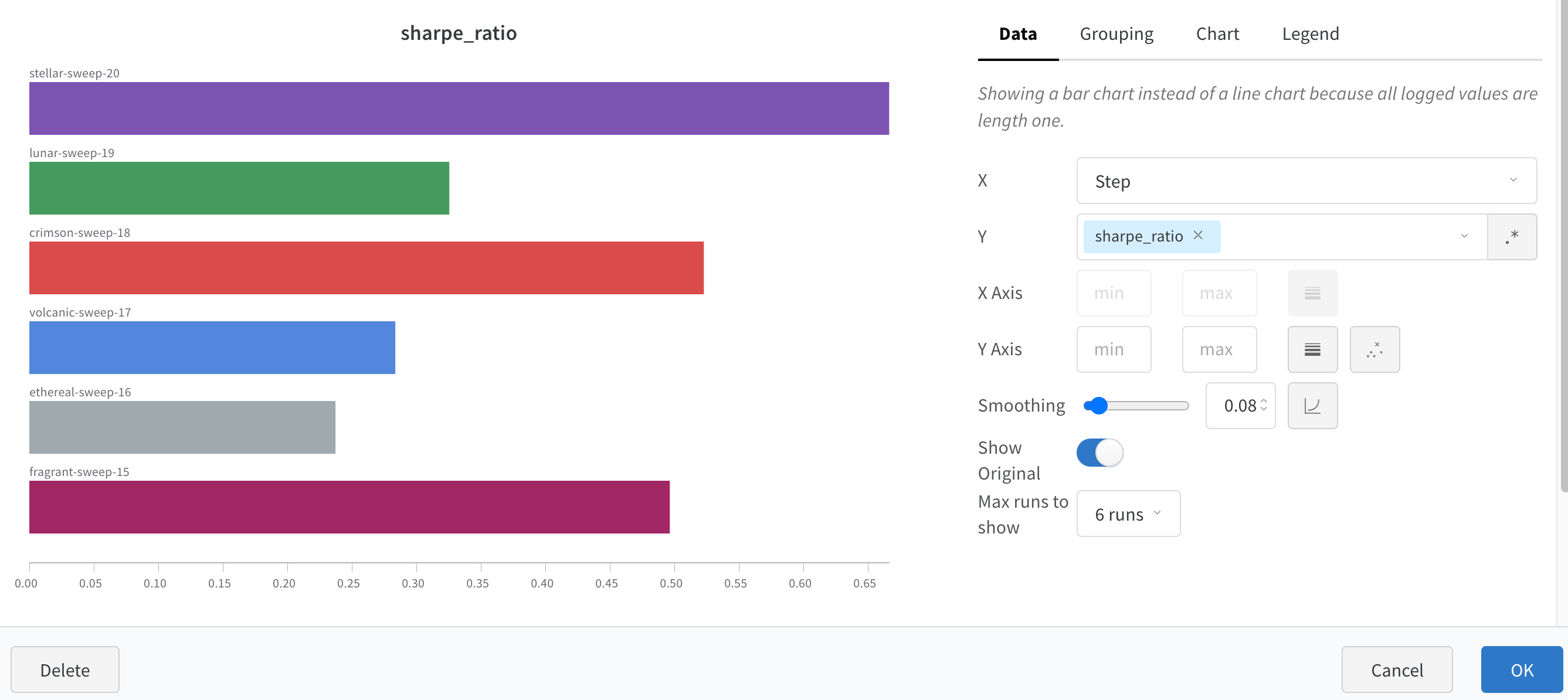
棒グラフは、矩形のバーでカテゴリカルデータを表示し、縦または横にプロットできます。全てのログされた値が長さ1の場合、**wandb.log()** を使用するとデフォルトで棒グラフが表示されます。
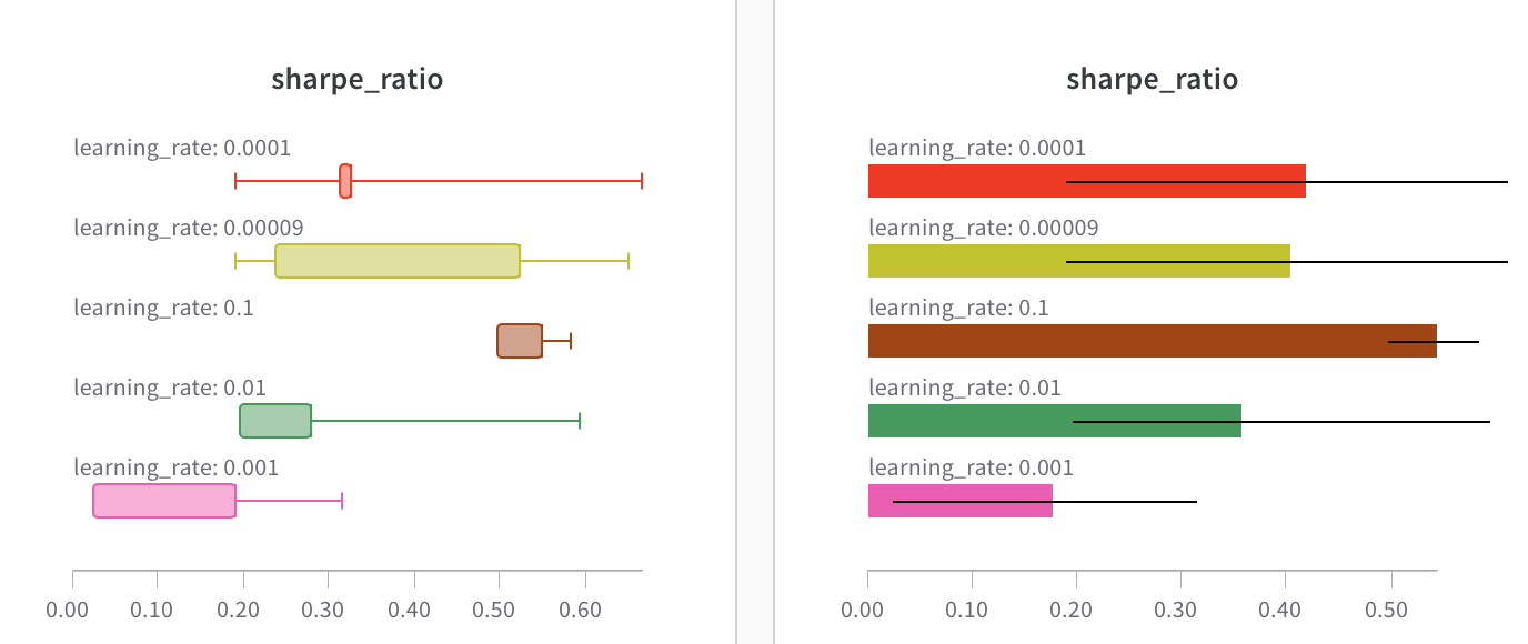 チャートの設定をカスタマイズして、表示する run の最大数を制限したり、任意の設定で run をグループ化したり、ラベルの名前を変更したりできます。
 ## 棒グラフのカスタマイズ
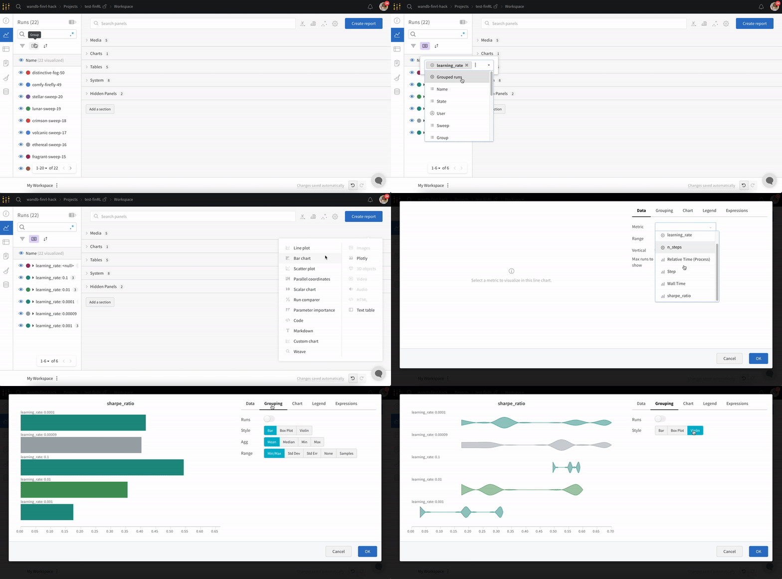
**Box** または **Violin** プロットを作成して、多くの要約統計量を1つのチャートタイプに組み合わせることもできます。
1. run テーブルで run をグループ化します。
2. ワークスペースで 'Add panel' をクリックします。
3. 標準の 'Bar Chart' を追加し、プロットする指標を選択します。
4. 'Grouping' タブの下で 'box plot' や 'Violin' などを選択して、これらのスタイルのいずれかをプロットします。
## 棒グラフのカスタマイズ
**Box** または **Violin** プロットを作成して、多くの要約統計量を1つのチャートタイプに組み合わせることもできます。
1. run テーブルで run をグループ化します。
2. ワークスペースで 'Add panel' をクリックします。
3. 標準の 'Bar Chart' を追加し、プロットする指標を選択します。
4. 'Grouping' タブの下で 'box plot' や 'Violin' などを選択して、これらのスタイルのいずれかをプロットします。