> ## Documentation Index
> Fetch the complete documentation index at: https://wb-21fd5541-feat-cli-docs-generator.mintlify.site/llms.txt
> Use this file to discover all available pages before exploring further.
# 実験からプロットを作成して追跡する
> 機械学習実験からプロットを作成し、追跡する。
Using the methods in `wandb.plot`, you can track charts with `wandb.log`, including charts that change over time during training. To learn more about our custom charting framework, check out [this guide](/ja/models/app/features/custom-charts/walkthrough/).
### Basic charts
これらのシンプルなチャートにより、メトリクスと結果の基本的な可視化を簡単に構築できます。
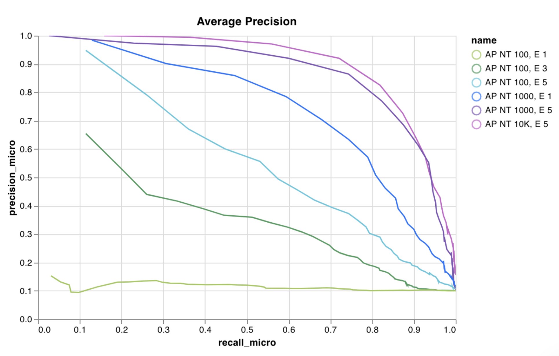
`wandb.plot.line()`
カスタムなラインプロット、任意の軸上で順序付けられたポイントのリストをログします。
```python theme={null}
data = [[x, y] for (x, y) in zip(x_values, y_values)]
table = wandb.Table(data=data, columns=["x", "y"])
wandb.log(
{
"my_custom_plot_id": wandb.plot.line(
table, "x", "y", title="Custom Y vs X Line Plot"
)
}
)
```
これは任意の2次元軸に曲線をログするために使用できます。二つの値のリストをプロットする場合、リスト内の値の数は正確に一致する必要があります。例えば、それぞれのポイントはxとyを持っている必要があります。
 [See in the app](https://wandb.ai/wandb/plots/reports/Custom-Line-Plots--VmlldzoyNjk5NTA)
[Run the code](https://tiny.cc/custom-charts)
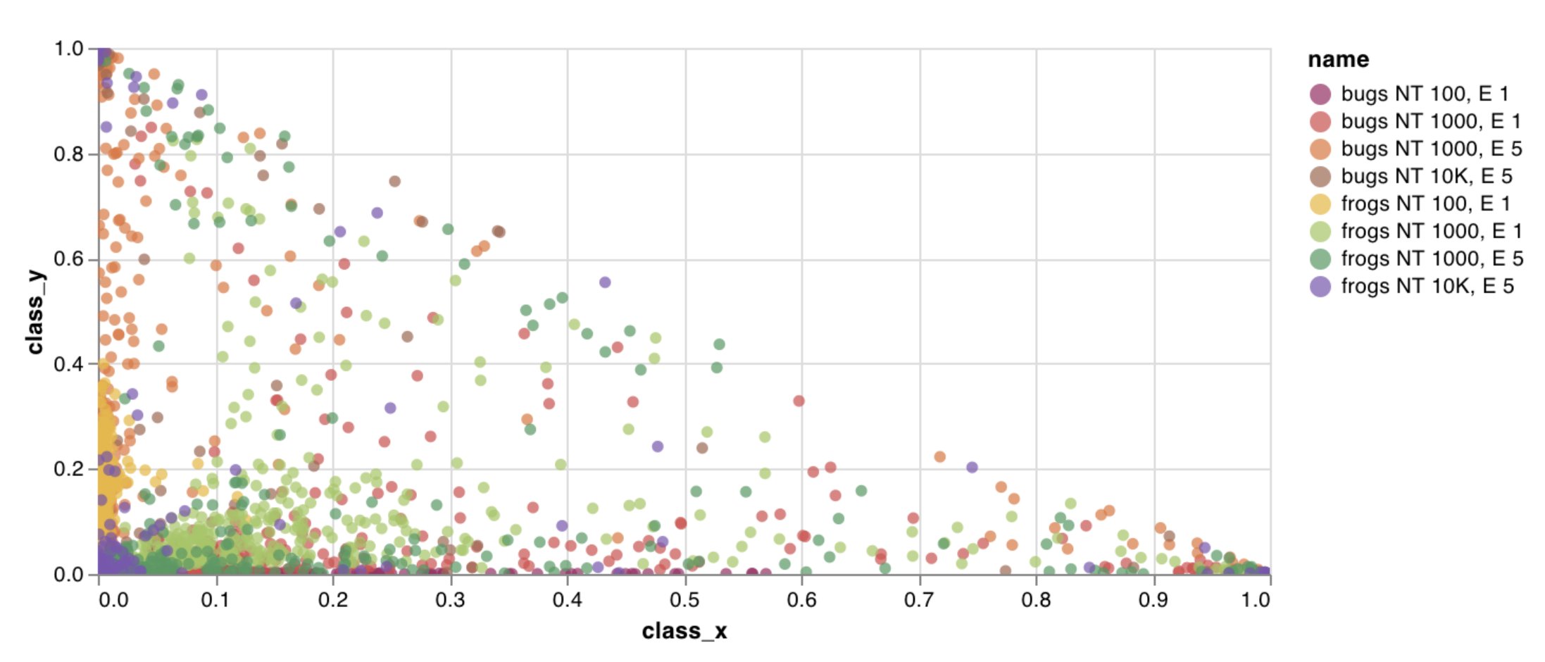
`wandb.plot.scatter()`
カスタムな散布図をログします—任意の軸xとy上のポイント(x, y)のリスト。
```python theme={null}
data = [[x, y] for (x, y) in zip(class_x_scores, class_y_scores)]
table = wandb.Table(data=data, columns=["class_x", "class_y"])
wandb.log({"my_custom_id": wandb.plot.scatter(table, "class_x", "class_y")})
```
これは任意の2次元軸に散布ポイントをログするために使用できます。二つの値のリストをプロットする場合、リスト内の値の数は正確に一致する必要があります。例えば、それぞれのポイントはxとyを持っている必要があります。
[See in the app](https://wandb.ai/wandb/plots/reports/Custom-Line-Plots--VmlldzoyNjk5NTA)
[Run the code](https://tiny.cc/custom-charts)
`wandb.plot.scatter()`
カスタムな散布図をログします—任意の軸xとy上のポイント(x, y)のリスト。
```python theme={null}
data = [[x, y] for (x, y) in zip(class_x_scores, class_y_scores)]
table = wandb.Table(data=data, columns=["class_x", "class_y"])
wandb.log({"my_custom_id": wandb.plot.scatter(table, "class_x", "class_y")})
```
これは任意の2次元軸に散布ポイントをログするために使用できます。二つの値のリストをプロットする場合、リスト内の値の数は正確に一致する必要があります。例えば、それぞれのポイントはxとyを持っている必要があります。
 [See in the app](https://wandb.ai/wandb/plots/reports/Custom-Scatter-Plots--VmlldzoyNjk5NDQ)
[Run the code](https://tiny.cc/custom-charts)
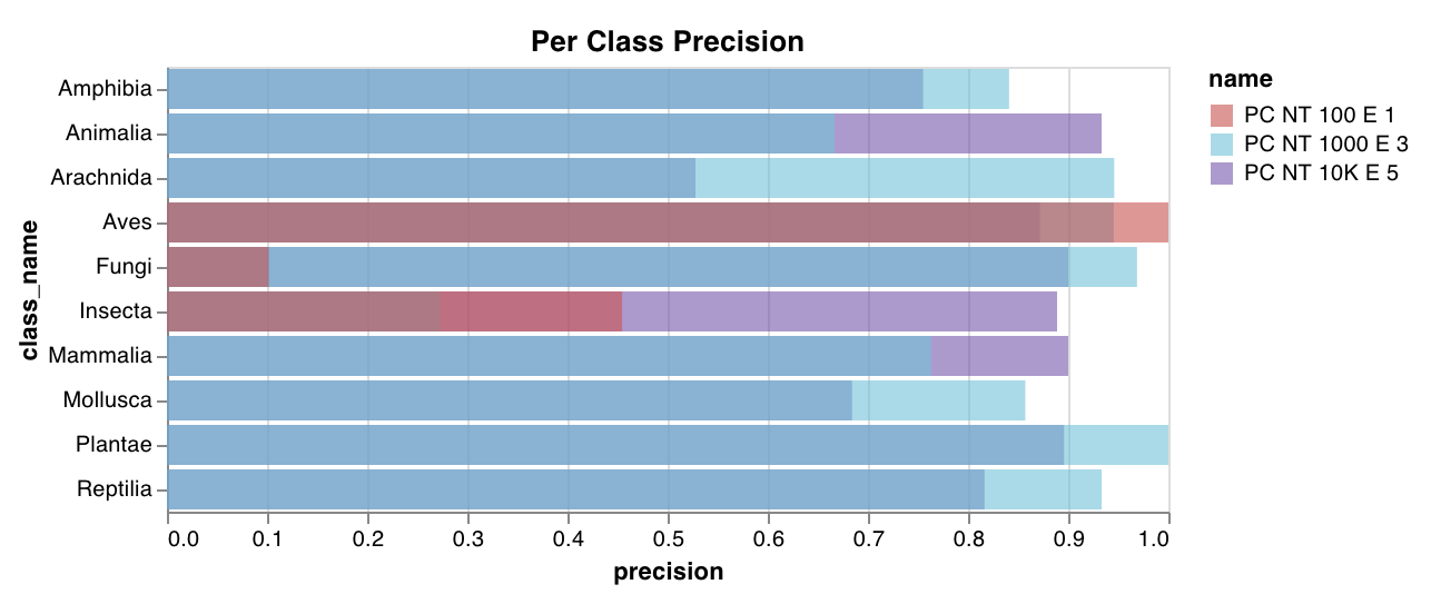
`wandb.plot.bar()`
カスタムな棒グラフをログします—数行でバーとしてラベル付けされた値のリストをネイティブに:
```python theme={null}
data = [[label, val] for (label, val) in zip(labels, values)]
table = wandb.Table(data=data, columns=["label", "value"])
wandb.log(
{
"my_bar_chart_id": wandb.plot.bar(
table, "label", "value", title="Custom Bar Chart"
)
}
)
```
これは任意の棒グラフをログするために使用できます。リスト内のラベルと値の数は正確に一致する必要があります。それぞれのデータポイントは両方を持たなければなりません。
[See in the app](https://wandb.ai/wandb/plots/reports/Custom-Scatter-Plots--VmlldzoyNjk5NDQ)
[Run the code](https://tiny.cc/custom-charts)
`wandb.plot.bar()`
カスタムな棒グラフをログします—数行でバーとしてラベル付けされた値のリストをネイティブに:
```python theme={null}
data = [[label, val] for (label, val) in zip(labels, values)]
table = wandb.Table(data=data, columns=["label", "value"])
wandb.log(
{
"my_bar_chart_id": wandb.plot.bar(
table, "label", "value", title="Custom Bar Chart"
)
}
)
```
これは任意の棒グラフをログするために使用できます。リスト内のラベルと値の数は正確に一致する必要があります。それぞれのデータポイントは両方を持たなければなりません。
 [See in the app](https://wandb.ai/wandb/plots/reports/Custom-Bar-Charts--VmlldzoyNzExNzk)
[Run the code](https://tiny.cc/custom-charts)
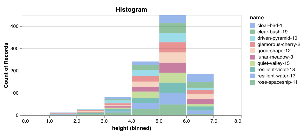
`wandb.plot.histogram()`
カスタムなヒストグラムをログします—発生のカウント/頻度でリスト内の値をビンへソートします—数行でネイティブに。予測信頼度スコア(`scores`)のリストがあって、その分布を可視化したいとします。
```python theme={null}
data = [[s] for s in scores]
table = wandb.Table(data=data, columns=["scores"])
wandb.log({"my_histogram": wandb.plot.histogram(table, "scores", title="Histogram")})
```
これは任意のヒストグラムをログするために使用できます。`data`はリストのリストで、行と列の2次元配列をサポートすることを意図しています。
[See in the app](https://wandb.ai/wandb/plots/reports/Custom-Bar-Charts--VmlldzoyNzExNzk)
[Run the code](https://tiny.cc/custom-charts)
`wandb.plot.histogram()`
カスタムなヒストグラムをログします—発生のカウント/頻度でリスト内の値をビンへソートします—数行でネイティブに。予測信頼度スコア(`scores`)のリストがあって、その分布を可視化したいとします。
```python theme={null}
data = [[s] for s in scores]
table = wandb.Table(data=data, columns=["scores"])
wandb.log({"my_histogram": wandb.plot.histogram(table, "scores", title="Histogram")})
```
これは任意のヒストグラムをログするために使用できます。`data`はリストのリストで、行と列の2次元配列をサポートすることを意図しています。
 [See in the app](https://wandb.ai/wandb/plots/reports/Custom-Histograms--VmlldzoyNzE0NzM)
[Run the code](https://tiny.cc/custom-charts)
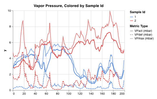
`wandb.plot.line_series()`
複数の線、または複数の異なるx-y座標ペアのリストを一つの共有x-y軸上にプロットします:
```python theme={null}
wandb.log(
{
"my_custom_id": wandb.plot.line_series(
xs=[0, 1, 2, 3, 4],
ys=[[10, 20, 30, 40, 50], [0.5, 11, 72, 3, 41]],
keys=["metric Y", "metric Z"],
title="Two Random Metrics",
xname="x units",
)
}
)
```
xとyのポイントの数は正確に一致する必要があることに注意してください。複数のy値のリストに合ったx値のリストを一つ提供することも、または各y値のリストに対して個別のx値のリストを提供することもできます。
[See in the app](https://wandb.ai/wandb/plots/reports/Custom-Histograms--VmlldzoyNzE0NzM)
[Run the code](https://tiny.cc/custom-charts)
`wandb.plot.line_series()`
複数の線、または複数の異なるx-y座標ペアのリストを一つの共有x-y軸上にプロットします:
```python theme={null}
wandb.log(
{
"my_custom_id": wandb.plot.line_series(
xs=[0, 1, 2, 3, 4],
ys=[[10, 20, 30, 40, 50], [0.5, 11, 72, 3, 41]],
keys=["metric Y", "metric Z"],
title="Two Random Metrics",
xname="x units",
)
}
)
```
xとyのポイントの数は正確に一致する必要があることに注意してください。複数のy値のリストに合ったx値のリストを一つ提供することも、または各y値のリストに対して個別のx値のリストを提供することもできます。
 [See in the app](https://wandb.ai/wandb/plots/reports/Custom-Multi-Line-Plots--VmlldzozOTMwMjU)
### Model evaluation charts
これらのプリセットチャートは、`wandb.plot`メソッド内蔵で、スクリプトからチャートを直接ログして、UIで正確に確認したい情報をすぐに把握できます。
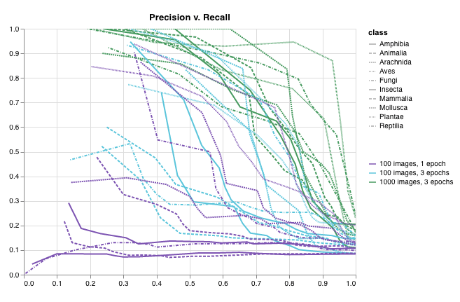
`wandb.plot.pr_curve()`
[Precision-Recall curve](https://scikit-learn.org/stable/modules/generated/sklearn.metrics.precision_recall_curve.html#sklearn.metrics.precision_recall_curve) を1行で作成します:
```python theme={null}
wandb.log({"pr": wandb.plot.pr_curve(ground_truth, predictions)})
```
コードが以下のものにアクセスできるときに、これをログできます:
* 一連の例に対するモデルの予測スコア(`predictions`)
* それらの例に対応する正解ラベル(`ground_truth`)
* (オプションで)ラベル/クラス名のリスト(`labels=["cat", "dog", "bird"...]` で、ラベルインデックスが0はcat、1はdog、2はbirdを意味するなど)
* (オプションで)プロットで可視化するラベルのサブセット
[See in the app](https://wandb.ai/wandb/plots/reports/Custom-Multi-Line-Plots--VmlldzozOTMwMjU)
### Model evaluation charts
これらのプリセットチャートは、`wandb.plot`メソッド内蔵で、スクリプトからチャートを直接ログして、UIで正確に確認したい情報をすぐに把握できます。
`wandb.plot.pr_curve()`
[Precision-Recall curve](https://scikit-learn.org/stable/modules/generated/sklearn.metrics.precision_recall_curve.html#sklearn.metrics.precision_recall_curve) を1行で作成します:
```python theme={null}
wandb.log({"pr": wandb.plot.pr_curve(ground_truth, predictions)})
```
コードが以下のものにアクセスできるときに、これをログできます:
* 一連の例に対するモデルの予測スコア(`predictions`)
* それらの例に対応する正解ラベル(`ground_truth`)
* (オプションで)ラベル/クラス名のリスト(`labels=["cat", "dog", "bird"...]` で、ラベルインデックスが0はcat、1はdog、2はbirdを意味するなど)
* (オプションで)プロットで可視化するラベルのサブセット
 [See in the app](https://wandb.ai/wandb/plots/reports/Plot-Precision-Recall-Curves--VmlldzoyNjk1ODY)
[Run the code](https://colab.research.google.com/drive/1mS8ogA3LcZWOXchfJoMrboW3opY1A8BY?usp=sharing)
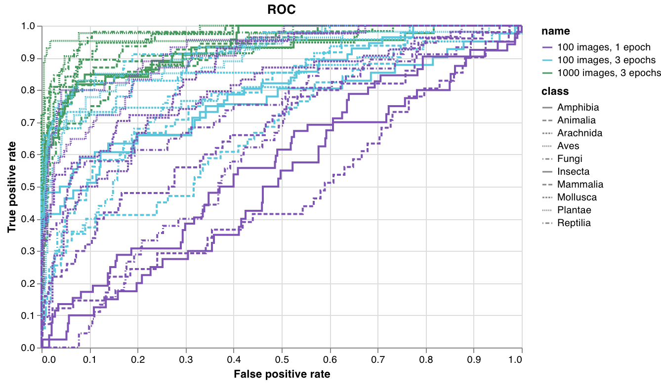
`wandb.plot.roc_curve()`
[ROC curve](https://scikit-learn.org/stable/modules/generated/sklearn.metrics.roc_curve.html#sklearn.metrics.roc_curve) を1行で作成します:
```python theme={null}
wandb.log({"roc": wandb.plot.roc_curve(ground_truth, predictions)})
```
コードが以下のものにアクセスできるときに、これをログできます:
* 一連の例に対するモデルの予測スコア(`predictions`)
* それらの例に対応する正解ラベル(`ground_truth`)
* (オプションで)ラベル/クラス名のリスト(`labels=["cat", "dog", "bird"...]` で、ラベルインデックスが0はcat、1はdog、2はbirdを意味するなど)
* (オプションで)プロットで可視化するラベルのサブセット(まだリスト形式)
[See in the app](https://wandb.ai/wandb/plots/reports/Plot-Precision-Recall-Curves--VmlldzoyNjk1ODY)
[Run the code](https://colab.research.google.com/drive/1mS8ogA3LcZWOXchfJoMrboW3opY1A8BY?usp=sharing)
`wandb.plot.roc_curve()`
[ROC curve](https://scikit-learn.org/stable/modules/generated/sklearn.metrics.roc_curve.html#sklearn.metrics.roc_curve) を1行で作成します:
```python theme={null}
wandb.log({"roc": wandb.plot.roc_curve(ground_truth, predictions)})
```
コードが以下のものにアクセスできるときに、これをログできます:
* 一連の例に対するモデルの予測スコア(`predictions`)
* それらの例に対応する正解ラベル(`ground_truth`)
* (オプションで)ラベル/クラス名のリスト(`labels=["cat", "dog", "bird"...]` で、ラベルインデックスが0はcat、1はdog、2はbirdを意味するなど)
* (オプションで)プロットで可視化するラベルのサブセット(まだリスト形式)
 [See in the app](https://wandb.ai/wandb/plots/reports/Plot-ROC-Curves--VmlldzoyNjk3MDE)
[Run the code](https://colab.research.google.com/github/wandb/examples/blob/master/colabs/wandb-log/Plot_ROC_Curves_with_W%26B.ipynb)
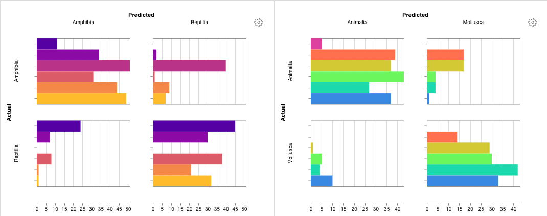
`wandb.plot.confusion_matrix()`
マルチクラスの[混同行列](https://scikit-learn.org/stable/auto_examples/model_selection/plot_confusion_matrix.html) を1行で作成します:
```python theme={null}
cm = wandb.plot.confusion_matrix(
y_true=ground_truth, preds=predictions, class_names=class_names
)
wandb.log({"conf_mat": cm})
```
コードが以下のものにアクセスできるときに、これをログできます:
* 一連の例に対するモデルの予測ラベル(`preds`)または正規化された確率スコア(`probs`)。確率は(例の数、クラスの数)という形でなければなりません。確率または予測のどちらでも良いですが両方を提供することはできません。
* それらの例に対応する正解ラベル(`y_true`)
* 文字列のラベル/クラス名のフルリスト(例:`class_names=["cat", "dog", "bird"]` で、インデックス0が`cat`、1が`dog`、2が`bird`である場合)
[See in the app](https://wandb.ai/wandb/plots/reports/Plot-ROC-Curves--VmlldzoyNjk3MDE)
[Run the code](https://colab.research.google.com/github/wandb/examples/blob/master/colabs/wandb-log/Plot_ROC_Curves_with_W%26B.ipynb)
`wandb.plot.confusion_matrix()`
マルチクラスの[混同行列](https://scikit-learn.org/stable/auto_examples/model_selection/plot_confusion_matrix.html) を1行で作成します:
```python theme={null}
cm = wandb.plot.confusion_matrix(
y_true=ground_truth, preds=predictions, class_names=class_names
)
wandb.log({"conf_mat": cm})
```
コードが以下のものにアクセスできるときに、これをログできます:
* 一連の例に対するモデルの予測ラベル(`preds`)または正規化された確率スコア(`probs`)。確率は(例の数、クラスの数)という形でなければなりません。確率または予測のどちらでも良いですが両方を提供することはできません。
* それらの例に対応する正解ラベル(`y_true`)
* 文字列のラベル/クラス名のフルリスト(例:`class_names=["cat", "dog", "bird"]` で、インデックス0が`cat`、1が`dog`、2が`bird`である場合)
 [See in the app](https://wandb.ai/wandb/plots/reports/Confusion-Matrix--VmlldzozMDg1NTM)
[Run the code](https://colab.research.google.com/github/wandb/examples/blob/master/colabs/wandb-log/Log_a_Confusion_Matrix_with_W%26B.ipynb)
### Interactive custom charts
完全なカスタマイズを行う場合、内蔵の[Custom Chart preset](/ja/models/app/features/custom-charts/walkthrough/)を調整するか、新しいプリセットを作成し、チャートを保存します。チャートIDを使用して、そのカスタムプリセットに直接スクリプトからデータをログします。
```python theme={null}
# 作成したい列を持つテーブルを作成
table = wandb.Table(data=data, columns=["step", "height"])
# テーブルの列からチャートのフィールドへマップ
fields = {"x": "step", "value": "height"}
# 新しいカスタムチャートプリセットにテーブルを使用
# 自分の保存したチャートプリセットを使用するには、vega_spec_nameを変更
# タイトルを編集するには、string_fieldsを変更
my_custom_chart = wandb.plot_table(
vega_spec_name="carey/new_chart",
data_table=table,
fields=fields,
string_fields={"title": "Height Histogram"},
)
```
[Run the code](https://tiny.cc/custom-charts)
### Matplotlib and Plotly plots
W\&Bの[Custom Charts](/ja/models/app/features/custom-charts/walkthrough/)を`wandb.plot`で使用する代わりに、[matplotlib](https://matplotlib.org/)や[Plotly](https://plotly.com/)で生成されたチャートをログすることができます。
```python theme={null}
import matplotlib.pyplot as plt
plt.plot([1, 2, 3, 4])
plt.ylabel("some interesting numbers")
wandb.log({"chart": plt})
```
`matplotlib`プロットまたは図オブジェクトを`wandb.log()`に渡すだけです。デフォルトでは、プロットを[Plotly](https://plot.ly/)プロットに変換します。プロットを画像としてログしたい場合は`wandb.Image`にプロットを渡すことができます。Plotlyチャートを直接受け入れることもできます。
「空のプロットをログしようとしました」というエラーが発生した場合は、プロットとは別に図を`fig = plt.figure()`として保存してから、`wandb.log`で`fig`をログできます。
### Log custom HTML to W\&B Tables
W\&Bでは、PlotlyやBokehからインタラクティブなチャートをHTMLとしてログし、Tablesに追加することをサポートしています。
#### Log Plotly figures to Tables as HTML
インタラクティブなPlotlyチャートをwandb TablesにHTML形式でログできます。
```python theme={null}
import wandb
import plotly.express as px
# 新しいrunを初期化
run = wandb.init(project="log-plotly-fig-tables", name="plotly_html")
# テーブルを作成
table = wandb.Table(columns=["plotly_figure"])
# Plotly図のパスを作成
path_to_plotly_html = "./plotly_figure.html"
# 例のPlotly図
fig = px.scatter(x=[0, 1, 2, 3, 4], y=[0, 1, 4, 9, 16])
# Plotly図をHTMLに書き込み
# auto_playをFalseに設定すると、アニメーション付きのPlotlyチャートが自動的にテーブル内で再生されないようにします
fig.write_html(path_to_plotly_html, auto_play=False)
# Plotly図をHTMLファイルとしてTableに追加
table.add_data(wandb.Html(path_to_plotly_html))
# Tableをログ
run.log({"test_table": table})
wandb.finish()
```
#### Log Bokeh figures to Tables as HTML
インタラクティブなBokehチャートをwandb TablesにHTML形式でログできます。
```python theme={null}
from scipy.signal import spectrogram
import holoviews as hv
import panel as pn
from scipy.io import wavfile
import numpy as np
from bokeh.resources import INLINE
hv.extension("bokeh", logo=False)
import wandb
def save_audio_with_bokeh_plot_to_html(audio_path, html_file_name):
sr, wav_data = wavfile.read(audio_path)
duration = len(wav_data) / sr
f, t, sxx = spectrogram(wav_data, sr)
spec_gram = hv.Image((t, f, np.log10(sxx)), ["Time (s)", "Frequency (hz)"]).opts(
width=500, height=150, labelled=[]
)
audio = pn.pane.Audio(wav_data, sample_rate=sr, name="Audio", throttle=500)
slider = pn.widgets.FloatSlider(end=duration, visible=False)
line = hv.VLine(0).opts(color="white")
slider.jslink(audio, value="time", bidirectional=True)
slider.jslink(line, value="glyph.location")
combined = pn.Row(audio, spec_gram * line, slider).save(html_file_name)
html_file_name = "audio_with_plot.html"
audio_path = "hello.wav"
save_audio_with_bokeh_plot_to_html(audio_path, html_file_name)
wandb_html = wandb.Html(html_file_name)
run = wandb.init(project="audio_test")
my_table = wandb.Table(columns=["audio_with_plot"], data=[[wandb_html], [wandb_html]])
run.log({"audio_table": my_table})
run.finish()
```
[See in the app](https://wandb.ai/wandb/plots/reports/Confusion-Matrix--VmlldzozMDg1NTM)
[Run the code](https://colab.research.google.com/github/wandb/examples/blob/master/colabs/wandb-log/Log_a_Confusion_Matrix_with_W%26B.ipynb)
### Interactive custom charts
完全なカスタマイズを行う場合、内蔵の[Custom Chart preset](/ja/models/app/features/custom-charts/walkthrough/)を調整するか、新しいプリセットを作成し、チャートを保存します。チャートIDを使用して、そのカスタムプリセットに直接スクリプトからデータをログします。
```python theme={null}
# 作成したい列を持つテーブルを作成
table = wandb.Table(data=data, columns=["step", "height"])
# テーブルの列からチャートのフィールドへマップ
fields = {"x": "step", "value": "height"}
# 新しいカスタムチャートプリセットにテーブルを使用
# 自分の保存したチャートプリセットを使用するには、vega_spec_nameを変更
# タイトルを編集するには、string_fieldsを変更
my_custom_chart = wandb.plot_table(
vega_spec_name="carey/new_chart",
data_table=table,
fields=fields,
string_fields={"title": "Height Histogram"},
)
```
[Run the code](https://tiny.cc/custom-charts)
### Matplotlib and Plotly plots
W\&Bの[Custom Charts](/ja/models/app/features/custom-charts/walkthrough/)を`wandb.plot`で使用する代わりに、[matplotlib](https://matplotlib.org/)や[Plotly](https://plotly.com/)で生成されたチャートをログすることができます。
```python theme={null}
import matplotlib.pyplot as plt
plt.plot([1, 2, 3, 4])
plt.ylabel("some interesting numbers")
wandb.log({"chart": plt})
```
`matplotlib`プロットまたは図オブジェクトを`wandb.log()`に渡すだけです。デフォルトでは、プロットを[Plotly](https://plot.ly/)プロットに変換します。プロットを画像としてログしたい場合は`wandb.Image`にプロットを渡すことができます。Plotlyチャートを直接受け入れることもできます。
「空のプロットをログしようとしました」というエラーが発生した場合は、プロットとは別に図を`fig = plt.figure()`として保存してから、`wandb.log`で`fig`をログできます。
### Log custom HTML to W\&B Tables
W\&Bでは、PlotlyやBokehからインタラクティブなチャートをHTMLとしてログし、Tablesに追加することをサポートしています。
#### Log Plotly figures to Tables as HTML
インタラクティブなPlotlyチャートをwandb TablesにHTML形式でログできます。
```python theme={null}
import wandb
import plotly.express as px
# 新しいrunを初期化
run = wandb.init(project="log-plotly-fig-tables", name="plotly_html")
# テーブルを作成
table = wandb.Table(columns=["plotly_figure"])
# Plotly図のパスを作成
path_to_plotly_html = "./plotly_figure.html"
# 例のPlotly図
fig = px.scatter(x=[0, 1, 2, 3, 4], y=[0, 1, 4, 9, 16])
# Plotly図をHTMLに書き込み
# auto_playをFalseに設定すると、アニメーション付きのPlotlyチャートが自動的にテーブル内で再生されないようにします
fig.write_html(path_to_plotly_html, auto_play=False)
# Plotly図をHTMLファイルとしてTableに追加
table.add_data(wandb.Html(path_to_plotly_html))
# Tableをログ
run.log({"test_table": table})
wandb.finish()
```
#### Log Bokeh figures to Tables as HTML
インタラクティブなBokehチャートをwandb TablesにHTML形式でログできます。
```python theme={null}
from scipy.signal import spectrogram
import holoviews as hv
import panel as pn
from scipy.io import wavfile
import numpy as np
from bokeh.resources import INLINE
hv.extension("bokeh", logo=False)
import wandb
def save_audio_with_bokeh_plot_to_html(audio_path, html_file_name):
sr, wav_data = wavfile.read(audio_path)
duration = len(wav_data) / sr
f, t, sxx = spectrogram(wav_data, sr)
spec_gram = hv.Image((t, f, np.log10(sxx)), ["Time (s)", "Frequency (hz)"]).opts(
width=500, height=150, labelled=[]
)
audio = pn.pane.Audio(wav_data, sample_rate=sr, name="Audio", throttle=500)
slider = pn.widgets.FloatSlider(end=duration, visible=False)
line = hv.VLine(0).opts(color="white")
slider.jslink(audio, value="time", bidirectional=True)
slider.jslink(line, value="glyph.location")
combined = pn.Row(audio, spec_gram * line, slider).save(html_file_name)
html_file_name = "audio_with_plot.html"
audio_path = "hello.wav"
save_audio_with_bokeh_plot_to_html(audio_path, html_file_name)
wandb_html = wandb.Html(html_file_name)
run = wandb.init(project="audio_test")
my_table = wandb.Table(columns=["audio_with_plot"], data=[[wandb_html], [wandb_html]])
run.log({"audio_table": my_table})
run.finish()
```