> ## Documentation Index
> Fetch the complete documentation index at: https://wb-21fd5541-feat-cli-docs-generator.mintlify.site/llms.txt
> Use this file to discover all available pages before exploring further.
> Create and track plots from machine learning experiments.
# Create and track plots from experiments
Using the methods in `wandb.plot`, you can track charts with `wandb.Run.log()`, including charts that change over time during training. To learn more about our custom charting framework, check out the [custom charts walkthrough](/models/app/features/custom-charts/walkthrough/).
### Basic charts
These simple charts make it easy to construct basic visualizations of metrics and results.
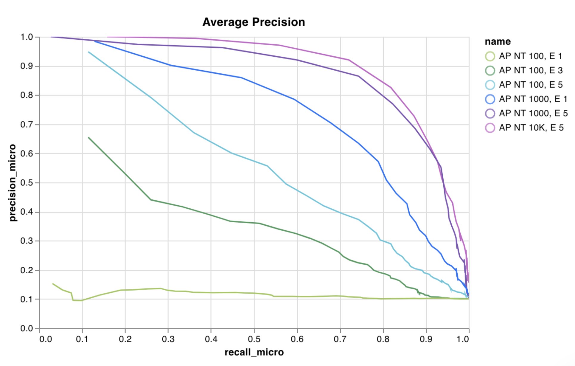
Log a custom line plot—a list of connected and ordered points on arbitrary axes.
```python theme={null}
import wandb
with wandb.init() as run:
data = [[x, y] for (x, y) in zip(x_values, y_values)]
table = wandb.Table(data=data, columns=["x", "y"])
run.log(
{
"my_custom_plot_id": wandb.plot.line(
table, "x", "y", title="Custom Y vs X Line Plot"
)
}
)
```
You can use this to log curves on any two dimensions. If you're plotting two lists of values against each other, the number of values in the lists must match exactly. For example, each point must have an x and a y.
 [See in the app](https://wandb.ai/wandb/plots/reports/Custom-Line-Plots--VmlldzoyNjk5NTA)
[Run the code](https://tiny.cc/custom-charts)
Log a custom scatter plot—a list of points (x, y) on a pair of arbitrary axes x and y.
```python theme={null}
import wandb
with wandb.init() as run:
data = [[x, y] for (x, y) in zip(class_x_scores, class_y_scores)]
table = wandb.Table(data=data, columns=["class_x", "class_y"])
run.log({"my_custom_id": wandb.plot.scatter(table, "class_x", "class_y")})
```
You can use this to log scatter points on any two dimensions. If you're plotting two lists of values against each other, the number of values in the lists must match exactly. For example, each point must have an x and a y.
[See in the app](https://wandb.ai/wandb/plots/reports/Custom-Line-Plots--VmlldzoyNjk5NTA)
[Run the code](https://tiny.cc/custom-charts)
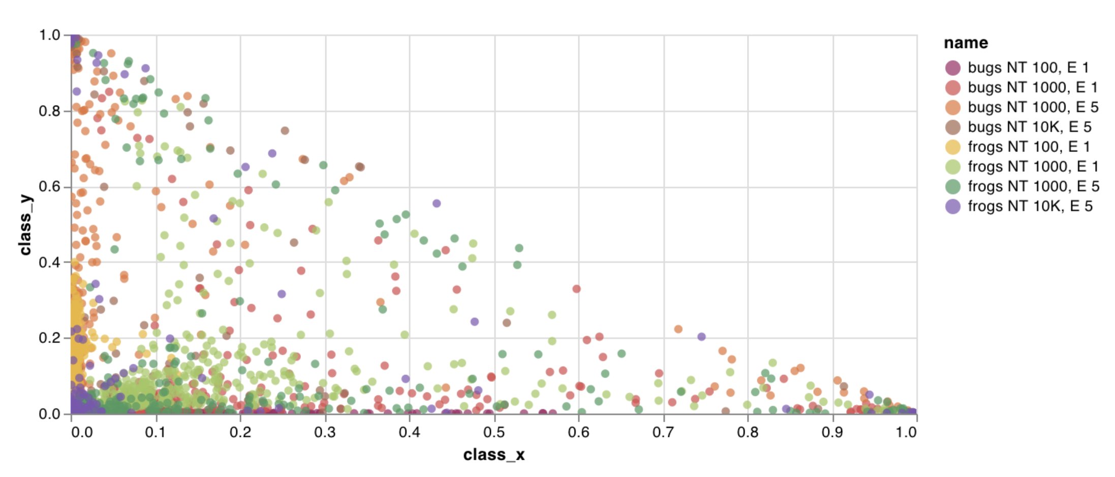
Log a custom scatter plot—a list of points (x, y) on a pair of arbitrary axes x and y.
```python theme={null}
import wandb
with wandb.init() as run:
data = [[x, y] for (x, y) in zip(class_x_scores, class_y_scores)]
table = wandb.Table(data=data, columns=["class_x", "class_y"])
run.log({"my_custom_id": wandb.plot.scatter(table, "class_x", "class_y")})
```
You can use this to log scatter points on any two dimensions. If you're plotting two lists of values against each other, the number of values in the lists must match exactly. For example, each point must have an x and a y.
 [See in the app](https://wandb.ai/wandb/plots/reports/Custom-Scatter-Plots--VmlldzoyNjk5NDQ)
[Run the code](https://tiny.cc/custom-charts)
Log a custom bar chart—a list of labeled values as bars—natively in a few lines:
```python theme={null}
import wandb
with wandb.init() as run:
data = [[label, val] for (label, val) in zip(labels, values)]
table = wandb.Table(data=data, columns=["label", "value"])
run.log(
{
"my_bar_chart_id": wandb.plot.bar(
table, "label", "value", title="Custom Bar Chart"
)
}
)
```
You can use this to log arbitrary bar charts. The number of labels and values in the lists must match exactly. Each data point must have both.
[See in the app](https://wandb.ai/wandb/plots/reports/Custom-Scatter-Plots--VmlldzoyNjk5NDQ)
[Run the code](https://tiny.cc/custom-charts)
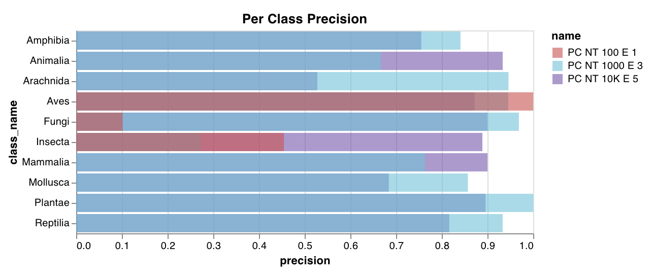
Log a custom bar chart—a list of labeled values as bars—natively in a few lines:
```python theme={null}
import wandb
with wandb.init() as run:
data = [[label, val] for (label, val) in zip(labels, values)]
table = wandb.Table(data=data, columns=["label", "value"])
run.log(
{
"my_bar_chart_id": wandb.plot.bar(
table, "label", "value", title="Custom Bar Chart"
)
}
)
```
You can use this to log arbitrary bar charts. The number of labels and values in the lists must match exactly. Each data point must have both.
 [See in the app](https://wandb.ai/wandb/plots/reports/Custom-Bar-Charts--VmlldzoyNzExNzk)
[Run the code](https://tiny.cc/custom-charts)
Log a custom histogram—sort a list of values into bins by count/frequency of occurrence—natively in a few lines. Let's say I have a list of prediction confidence scores (`scores`) and want to visualize their distribution:
```python theme={null}
import wandb
with wandb.init() as run:
data = [[s] for s in scores]
table = wandb.Table(data=data, columns=["scores"])
run.log({"my_histogram": wandb.plot.histogram(table, "scores", title="Histogram")})
```
You can use this to log arbitrary histograms. Note that `data` is a list of lists, intended to support a 2D array of rows and columns.
[See in the app](https://wandb.ai/wandb/plots/reports/Custom-Bar-Charts--VmlldzoyNzExNzk)
[Run the code](https://tiny.cc/custom-charts)
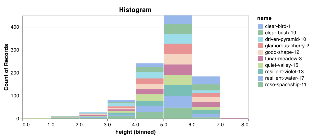
Log a custom histogram—sort a list of values into bins by count/frequency of occurrence—natively in a few lines. Let's say I have a list of prediction confidence scores (`scores`) and want to visualize their distribution:
```python theme={null}
import wandb
with wandb.init() as run:
data = [[s] for s in scores]
table = wandb.Table(data=data, columns=["scores"])
run.log({"my_histogram": wandb.plot.histogram(table, "scores", title="Histogram")})
```
You can use this to log arbitrary histograms. Note that `data` is a list of lists, intended to support a 2D array of rows and columns.
 [See in the app](https://wandb.ai/wandb/plots/reports/Custom-Histograms--VmlldzoyNzE0NzM)
[Run the code](https://tiny.cc/custom-charts)
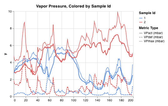
Plot multiple lines, or multiple different lists of x-y coordinate pairs, on one shared set of x-y axes:
```python theme={null}
import wandb
with wandb.init() as run:
run.log(
{
"my_custom_id": wandb.plot.line_series(
xs=[0, 1, 2, 3, 4],
ys=[[10, 20, 30, 40, 50], [0.5, 11, 72, 3, 41]],
keys=["metric Y", "metric Z"],
title="Two Random Metrics",
xname="x units",
)
}
)
```
Note that the number of x and y points must match exactly. You can supply one list of x values to match multiple lists of y values, or a separate list of x values for each list of y values.
[See in the app](https://wandb.ai/wandb/plots/reports/Custom-Histograms--VmlldzoyNzE0NzM)
[Run the code](https://tiny.cc/custom-charts)
Plot multiple lines, or multiple different lists of x-y coordinate pairs, on one shared set of x-y axes:
```python theme={null}
import wandb
with wandb.init() as run:
run.log(
{
"my_custom_id": wandb.plot.line_series(
xs=[0, 1, 2, 3, 4],
ys=[[10, 20, 30, 40, 50], [0.5, 11, 72, 3, 41]],
keys=["metric Y", "metric Z"],
title="Two Random Metrics",
xname="x units",
)
}
)
```
Note that the number of x and y points must match exactly. You can supply one list of x values to match multiple lists of y values, or a separate list of x values for each list of y values.
 [See in the app](https://wandb.ai/wandb/plots/reports/Custom-Multi-Line-Plots--VmlldzozOTMwMjU)
### Model evaluation charts
These preset charts have built-in `wandb.plot()` methods that make it quick and easy to log charts directly from your script and see the exact information you're looking for in the UI.
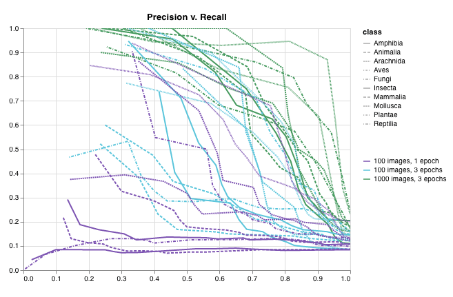
Create a [Precision-Recall curve](https://scikit-learn.org/stable/modules/generated/sklearn.metrics.precision_recall_curve.html#sklearn.metrics.precision_recall_curve) in one line:
```python theme={null}
import wandb
with wandb.init() as run:
# ground_truth is a list of true labels, predictions is a list of predicted scores
# e.g. ground_truth = [0, 1, 1, 0], predictions = [0.1, 0.4, 0.35, 0.8]
ground_truth = [0, 1, 1, 0]
predictions = [0.1, 0.4, 0.35, 0.8]
run.log({"pr": wandb.plot.pr_curve(ground_truth, predictions)})
```
You can log this whenever your code has access to:
* a model's predicted scores (`predictions`) on a set of examples
* the corresponding ground truth labels (`ground_truth`) for those examples
* (optionally) a list of the labels/class names (`labels=["cat", "dog", "bird"...]` if label index 0 means cat, 1 = dog, 2 = bird, etc.)
* (optionally) a subset (still in list format) of the labels to visualize in the plot
[See in the app](https://wandb.ai/wandb/plots/reports/Custom-Multi-Line-Plots--VmlldzozOTMwMjU)
### Model evaluation charts
These preset charts have built-in `wandb.plot()` methods that make it quick and easy to log charts directly from your script and see the exact information you're looking for in the UI.
Create a [Precision-Recall curve](https://scikit-learn.org/stable/modules/generated/sklearn.metrics.precision_recall_curve.html#sklearn.metrics.precision_recall_curve) in one line:
```python theme={null}
import wandb
with wandb.init() as run:
# ground_truth is a list of true labels, predictions is a list of predicted scores
# e.g. ground_truth = [0, 1, 1, 0], predictions = [0.1, 0.4, 0.35, 0.8]
ground_truth = [0, 1, 1, 0]
predictions = [0.1, 0.4, 0.35, 0.8]
run.log({"pr": wandb.plot.pr_curve(ground_truth, predictions)})
```
You can log this whenever your code has access to:
* a model's predicted scores (`predictions`) on a set of examples
* the corresponding ground truth labels (`ground_truth`) for those examples
* (optionally) a list of the labels/class names (`labels=["cat", "dog", "bird"...]` if label index 0 means cat, 1 = dog, 2 = bird, etc.)
* (optionally) a subset (still in list format) of the labels to visualize in the plot
 [See in the app](https://wandb.ai/wandb/plots/reports/Plot-Precision-Recall-Curves--VmlldzoyNjk1ODY)
[Run the code](https://colab.research.google.com/drive/1mS8ogA3LcZWOXchfJoMrboW3opY1A8BY?usp=sharing)
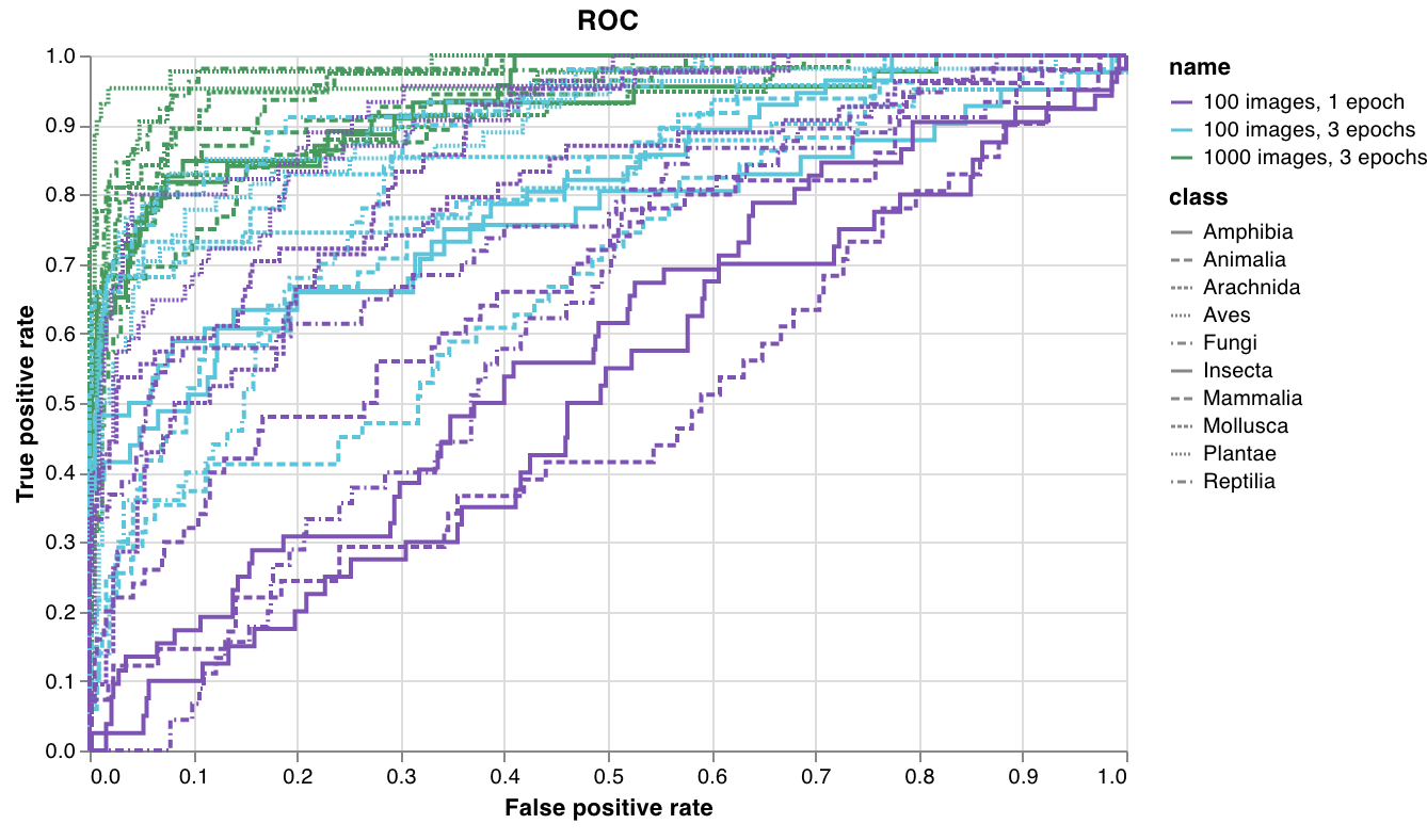
Create an [ROC curve](https://scikit-learn.org/stable/modules/generated/sklearn.metrics.roc_curve.html#sklearn.metrics.roc_curve) in one line:
```python theme={null}
import wandb
with wandb.init() as run:
# ground_truth is a list of true labels, predictions is a list of predicted scores
# e.g. ground_truth = [0, 1, 1, 0], predictions = [0.1, 0.4, 0.35, 0.8]
ground_truth = [0, 1, 1, 0]
predictions = [0.1, 0.4, 0.35, 0.8]
run.log({"roc": wandb.plot.roc_curve(ground_truth, predictions)})
```
You can log this whenever your code has access to:
* a model's predicted scores (`predictions`) on a set of examples
* the corresponding ground truth labels (`ground_truth`) for those examples
* (optionally) a list of the labels/ class names (`labels=["cat", "dog", "bird"...]` if label index 0 means cat, 1 = dog, 2 = bird, etc.)
* (optionally) a subset (still in list format) of these labels to visualize on the plot
[See in the app](https://wandb.ai/wandb/plots/reports/Plot-Precision-Recall-Curves--VmlldzoyNjk1ODY)
[Run the code](https://colab.research.google.com/drive/1mS8ogA3LcZWOXchfJoMrboW3opY1A8BY?usp=sharing)
Create an [ROC curve](https://scikit-learn.org/stable/modules/generated/sklearn.metrics.roc_curve.html#sklearn.metrics.roc_curve) in one line:
```python theme={null}
import wandb
with wandb.init() as run:
# ground_truth is a list of true labels, predictions is a list of predicted scores
# e.g. ground_truth = [0, 1, 1, 0], predictions = [0.1, 0.4, 0.35, 0.8]
ground_truth = [0, 1, 1, 0]
predictions = [0.1, 0.4, 0.35, 0.8]
run.log({"roc": wandb.plot.roc_curve(ground_truth, predictions)})
```
You can log this whenever your code has access to:
* a model's predicted scores (`predictions`) on a set of examples
* the corresponding ground truth labels (`ground_truth`) for those examples
* (optionally) a list of the labels/ class names (`labels=["cat", "dog", "bird"...]` if label index 0 means cat, 1 = dog, 2 = bird, etc.)
* (optionally) a subset (still in list format) of these labels to visualize on the plot
 [See in the app](https://wandb.ai/wandb/plots/reports/Plot-ROC-Curves--VmlldzoyNjk3MDE)
[Run the code](https://colab.research.google.com/github/wandb/examples/blob/master/colabs/wandb-log/Plot_ROC_Curves_with_W%26B.ipynb)
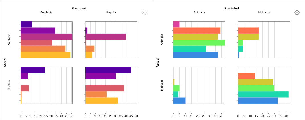
Create a multi-class [confusion matrix](https://scikit-learn.org/stable/auto_examples/model_selection/plot_confusion_matrix.html) in one line:
```python theme={null}
import wandb
cm = wandb.plot.confusion_matrix(
y_true=ground_truth, preds=predictions, class_names=class_names
)
with wandb.init() as run:
run.log({"conf_mat": cm})
```
You can log this wherever your code has access to:
* a model's predicted labels on a set of examples (`preds`) or the normalized probability scores (`probs`). The probabilities must have the shape (number of examples, number of classes). You can supply either probabilities or predictions but not both.
* the corresponding ground truth labels for those examples (`y_true`)
* a full list of the labels/class names as strings of `class_names`. Examples: `class_names=["cat", "dog", "bird"]` if index 0 is `cat`, 1 is `dog`, 2 is `bird`.
[See in the app](https://wandb.ai/wandb/plots/reports/Plot-ROC-Curves--VmlldzoyNjk3MDE)
[Run the code](https://colab.research.google.com/github/wandb/examples/blob/master/colabs/wandb-log/Plot_ROC_Curves_with_W%26B.ipynb)
Create a multi-class [confusion matrix](https://scikit-learn.org/stable/auto_examples/model_selection/plot_confusion_matrix.html) in one line:
```python theme={null}
import wandb
cm = wandb.plot.confusion_matrix(
y_true=ground_truth, preds=predictions, class_names=class_names
)
with wandb.init() as run:
run.log({"conf_mat": cm})
```
You can log this wherever your code has access to:
* a model's predicted labels on a set of examples (`preds`) or the normalized probability scores (`probs`). The probabilities must have the shape (number of examples, number of classes). You can supply either probabilities or predictions but not both.
* the corresponding ground truth labels for those examples (`y_true`)
* a full list of the labels/class names as strings of `class_names`. Examples: `class_names=["cat", "dog", "bird"]` if index 0 is `cat`, 1 is `dog`, 2 is `bird`.
 [See in the app](https://wandb.ai/wandb/plots/reports/Confusion-Matrix--VmlldzozMDg1NTM)
[Run the code](https://colab.research.google.com/github/wandb/examples/blob/master/colabs/wandb-log/Log_a_Confusion_Matrix_with_W%26B.ipynb)
### Interactive custom charts
For full customization, tweak a built-in [Custom Chart preset](/models/app/features/custom-charts/walkthrough/) or create a new preset, then save the chart. Use the chart ID to log data to that custom preset directly from your script.
```python theme={null}
import wandb
# Create a table with the columns to plot
table = wandb.Table(data=data, columns=["step", "height"])
# Map from the table's columns to the chart's fields
fields = {"x": "step", "value": "height"}
# Use the table to populate the new custom chart preset
# To use your own saved chart preset, change the vega_spec_name
# To edit the title, change the string_fields
my_custom_chart = wandb.plot_table(
vega_spec_name="carey/new_chart",
data_table=table,
fields=fields,
string_fields={"title": "Height Histogram"},
)
with wandb.init() as run:
# Log the custom chart
run.log({"my_custom_chart": my_custom_chart})
```
[Run the code](https://tiny.cc/custom-charts)
### Matplotlib and Plotly plots
Instead of using W\&B [Custom Charts](/models/app/features/custom-charts/walkthrough/) with `wandb.plot()`, you can log charts generated with [matplotlib](https://matplotlib.org/) and [Plotly](https://plotly.com/).
```python theme={null}
import wandb
import matplotlib.pyplot as plt
with wandb.init() as run:
# Create a simple matplotlib plot
plt.figure()
plt.plot([1, 2, 3, 4])
plt.ylabel("some interesting numbers")
# Log the plot to W&B
run.log({"chart": plt})
```
Just pass a `matplotlib` plot or figure object to `wandb.Run.log()`. By default we'll convert the plot into a [Plotly](https://plot.ly/) plot. If you'd rather log the plot as an image, you can pass the plot into `wandb.Image`. We also accept Plotly charts directly.
If you’re getting an error “You attempted to log an empty plot” then you can store the figure separately from the plot with `fig = plt.figure()` and then log `fig` in your call to `wandb.Run.log()`.
### Log custom HTML to W\&B Tables
W\&B supports logging interactive charts from Plotly and Bokeh as HTML and adding them to Tables.
#### Log Plotly figures to Tables as HTML
You can log interactive Plotly charts to wandb Tables by converting them to HTML.
```python theme={null}
import wandb
import plotly.express as px
# Initialize a new run
with wandb.init(project="log-plotly-fig-tables", name="plotly_html") as run:
# Create a table
table = wandb.Table(columns=["plotly_figure"])
# Create path for Plotly figure
path_to_plotly_html = "./plotly_figure.html"
# Example Plotly figure
fig = px.scatter(x=[0, 1, 2, 3, 4], y=[0, 1, 4, 9, 16])
# Write Plotly figure to HTML
# Set auto_play to False prevents animated Plotly charts
# from playing in the table automatically
fig.write_html(path_to_plotly_html, auto_play=False)
# Add Plotly figure as HTML file into Table
table.add_data(wandb.Html(path_to_plotly_html))
# Log Table
run.log({"test_table": table})
```
#### Log Bokeh figures to Tables as HTML
You can log interactive Bokeh charts to wandb Tables by converting them to HTML.
```python theme={null}
from scipy.signal import spectrogram
import holoviews as hv
import panel as pn
from scipy.io import wavfile
import numpy as np
from bokeh.resources import INLINE
hv.extension("bokeh", logo=False)
import wandb
def save_audio_with_bokeh_plot_to_html(audio_path, html_file_name):
sr, wav_data = wavfile.read(audio_path)
duration = len(wav_data) / sr
f, t, sxx = spectrogram(wav_data, sr)
spec_gram = hv.Image((t, f, np.log10(sxx)), ["Time (s)", "Frequency (hz)"]).opts(
width=500, height=150, labelled=[]
)
audio = pn.pane.Audio(wav_data, sample_rate=sr, name="Audio", throttle=500)
slider = pn.widgets.FloatSlider(end=duration, visible=False)
line = hv.VLine(0).opts(color="white")
slider.jslink(audio, value="time", bidirectional=True)
slider.jslink(line, value="glyph.location")
combined = pn.Row(audio, spec_gram * line, slider).save(html_file_name)
html_file_name = "audio_with_plot.html"
audio_path = "hello.wav"
save_audio_with_bokeh_plot_to_html(audio_path, html_file_name)
wandb_html = wandb.Html(html_file_name)
with wandb.init(project="audio_test") as run:
my_table = wandb.Table(columns=["audio_with_plot"], data=[[wandb_html]])
run.log({"audio_table": my_table})
```
[See in the app](https://wandb.ai/wandb/plots/reports/Confusion-Matrix--VmlldzozMDg1NTM)
[Run the code](https://colab.research.google.com/github/wandb/examples/blob/master/colabs/wandb-log/Log_a_Confusion_Matrix_with_W%26B.ipynb)
### Interactive custom charts
For full customization, tweak a built-in [Custom Chart preset](/models/app/features/custom-charts/walkthrough/) or create a new preset, then save the chart. Use the chart ID to log data to that custom preset directly from your script.
```python theme={null}
import wandb
# Create a table with the columns to plot
table = wandb.Table(data=data, columns=["step", "height"])
# Map from the table's columns to the chart's fields
fields = {"x": "step", "value": "height"}
# Use the table to populate the new custom chart preset
# To use your own saved chart preset, change the vega_spec_name
# To edit the title, change the string_fields
my_custom_chart = wandb.plot_table(
vega_spec_name="carey/new_chart",
data_table=table,
fields=fields,
string_fields={"title": "Height Histogram"},
)
with wandb.init() as run:
# Log the custom chart
run.log({"my_custom_chart": my_custom_chart})
```
[Run the code](https://tiny.cc/custom-charts)
### Matplotlib and Plotly plots
Instead of using W\&B [Custom Charts](/models/app/features/custom-charts/walkthrough/) with `wandb.plot()`, you can log charts generated with [matplotlib](https://matplotlib.org/) and [Plotly](https://plotly.com/).
```python theme={null}
import wandb
import matplotlib.pyplot as plt
with wandb.init() as run:
# Create a simple matplotlib plot
plt.figure()
plt.plot([1, 2, 3, 4])
plt.ylabel("some interesting numbers")
# Log the plot to W&B
run.log({"chart": plt})
```
Just pass a `matplotlib` plot or figure object to `wandb.Run.log()`. By default we'll convert the plot into a [Plotly](https://plot.ly/) plot. If you'd rather log the plot as an image, you can pass the plot into `wandb.Image`. We also accept Plotly charts directly.
If you’re getting an error “You attempted to log an empty plot” then you can store the figure separately from the plot with `fig = plt.figure()` and then log `fig` in your call to `wandb.Run.log()`.
### Log custom HTML to W\&B Tables
W\&B supports logging interactive charts from Plotly and Bokeh as HTML and adding them to Tables.
#### Log Plotly figures to Tables as HTML
You can log interactive Plotly charts to wandb Tables by converting them to HTML.
```python theme={null}
import wandb
import plotly.express as px
# Initialize a new run
with wandb.init(project="log-plotly-fig-tables", name="plotly_html") as run:
# Create a table
table = wandb.Table(columns=["plotly_figure"])
# Create path for Plotly figure
path_to_plotly_html = "./plotly_figure.html"
# Example Plotly figure
fig = px.scatter(x=[0, 1, 2, 3, 4], y=[0, 1, 4, 9, 16])
# Write Plotly figure to HTML
# Set auto_play to False prevents animated Plotly charts
# from playing in the table automatically
fig.write_html(path_to_plotly_html, auto_play=False)
# Add Plotly figure as HTML file into Table
table.add_data(wandb.Html(path_to_plotly_html))
# Log Table
run.log({"test_table": table})
```
#### Log Bokeh figures to Tables as HTML
You can log interactive Bokeh charts to wandb Tables by converting them to HTML.
```python theme={null}
from scipy.signal import spectrogram
import holoviews as hv
import panel as pn
from scipy.io import wavfile
import numpy as np
from bokeh.resources import INLINE
hv.extension("bokeh", logo=False)
import wandb
def save_audio_with_bokeh_plot_to_html(audio_path, html_file_name):
sr, wav_data = wavfile.read(audio_path)
duration = len(wav_data) / sr
f, t, sxx = spectrogram(wav_data, sr)
spec_gram = hv.Image((t, f, np.log10(sxx)), ["Time (s)", "Frequency (hz)"]).opts(
width=500, height=150, labelled=[]
)
audio = pn.pane.Audio(wav_data, sample_rate=sr, name="Audio", throttle=500)
slider = pn.widgets.FloatSlider(end=duration, visible=False)
line = hv.VLine(0).opts(color="white")
slider.jslink(audio, value="time", bidirectional=True)
slider.jslink(line, value="glyph.location")
combined = pn.Row(audio, spec_gram * line, slider).save(html_file_name)
html_file_name = "audio_with_plot.html"
audio_path = "hello.wav"
save_audio_with_bokeh_plot_to_html(audio_path, html_file_name)
wandb_html = wandb.Html(html_file_name)
with wandb.init(project="audio_test") as run:
my_table = wandb.Table(columns=["audio_with_plot"], data=[[wandb_html]])
run.log({"audio_table": my_table})
```